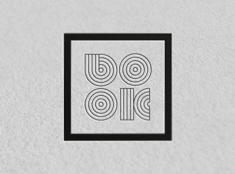
The logo Book, created in June 2013 by Maurizio Pagnozzi, is part of a study project for a course in graphic design followed by the author at ILAS, Institute of Communication of Naples.
The aim of this project is a book publication, One designer, dedicated to the major graphic designers of the twentieth century, the logo Book is for an hypothetical publishing house .
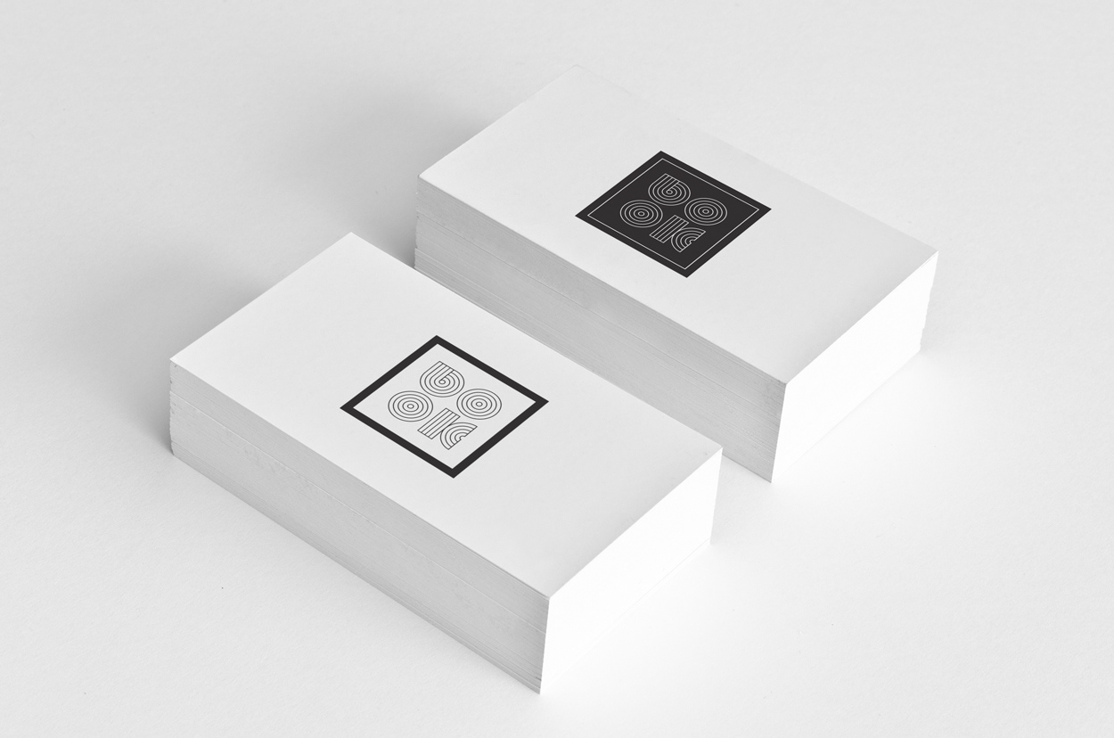
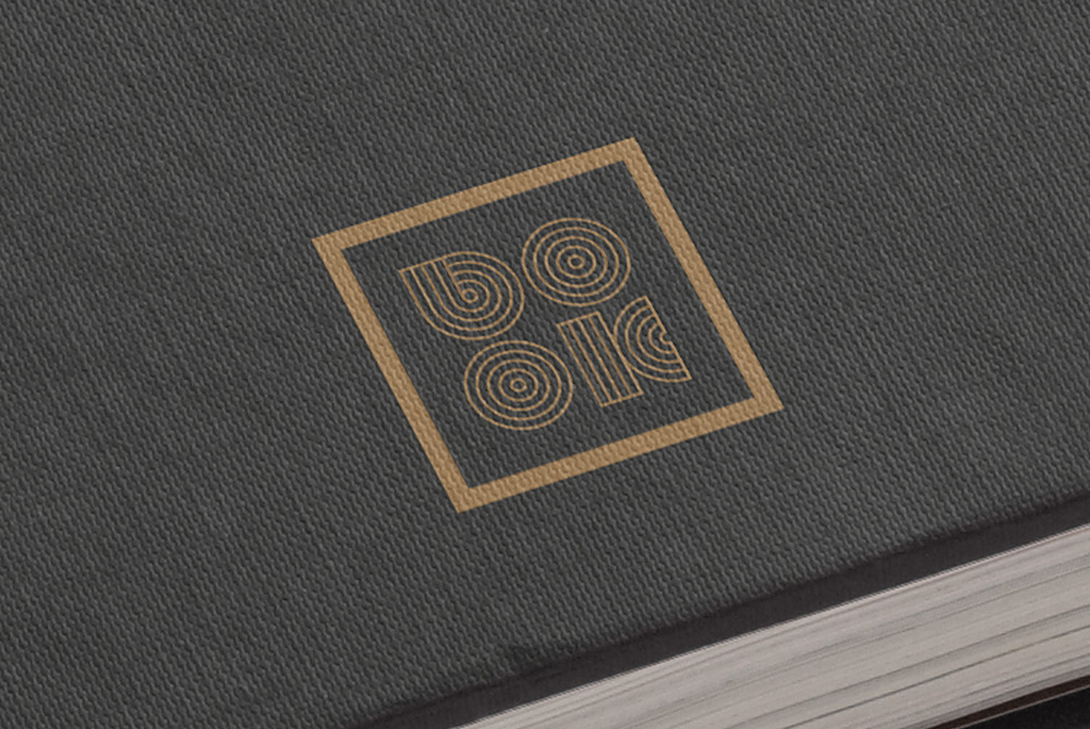
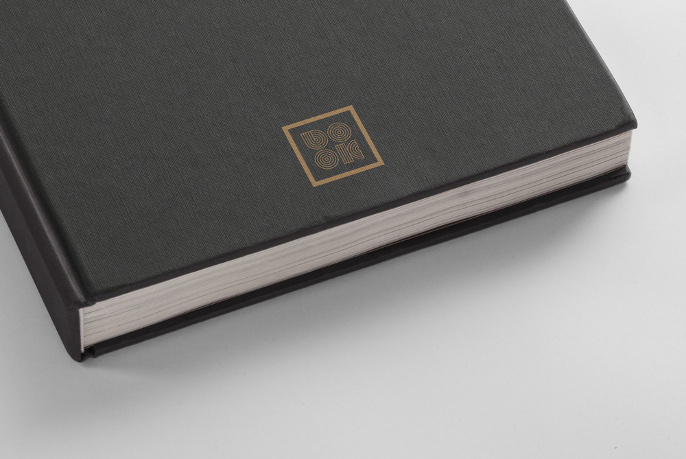
The simplicity sought by the author is expressed in the arrangement of the letters which form the word Book, two letters for line enclosed by a square shape flat. The strength of the project, is entirely expressed by the shape of the letters, concentric circles that lead the eyes of the observer in an hypnotic game. Hypnotic should be reading the books published by this publishing house .The corporate color used is black, a color that recalls the elegance,but there is also a special edition in red and gold.
From this project, the author has also developed the entire font, called Strabilio.

Special Edition // Gold Series
Special Edition // Red Series

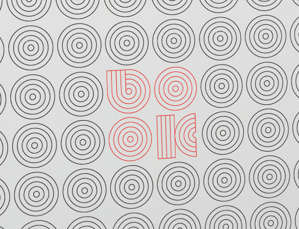
Strabilio Font created by Maurizio Pagnozzi.
THANKS FOR YOUR COMMENTS AND APPRECIATIONS
I am available for freelance work
info@mauriziopagnozzi.com


